Medspa by Rayray Project
A free mockup for The Medspa by Rayray, an Irving, Texas med spa whose website was a Wix template. Each treatment family has its own article, booking takes one tap on any screen, and Google gets the address and hours.
Client
The Medspa by Rayray · Irving, Texas
Disciplines
Web · Content for Google and AI · Design that sells
Type
Free mockup
Live
Strong Instagram reputation, a template website.
The Medspa by Rayray has served Irving, Texas, since 2014. It offers injectables, facial and scalp PRP, peels, facials, and microblading, and its reputation has grown through word of mouth and the results it posts on Instagram.
Its website was a free Wix template, with treatments listed as loose tags and little explanation of each one. We built this version as an introduction, using photos and information from the business itself.
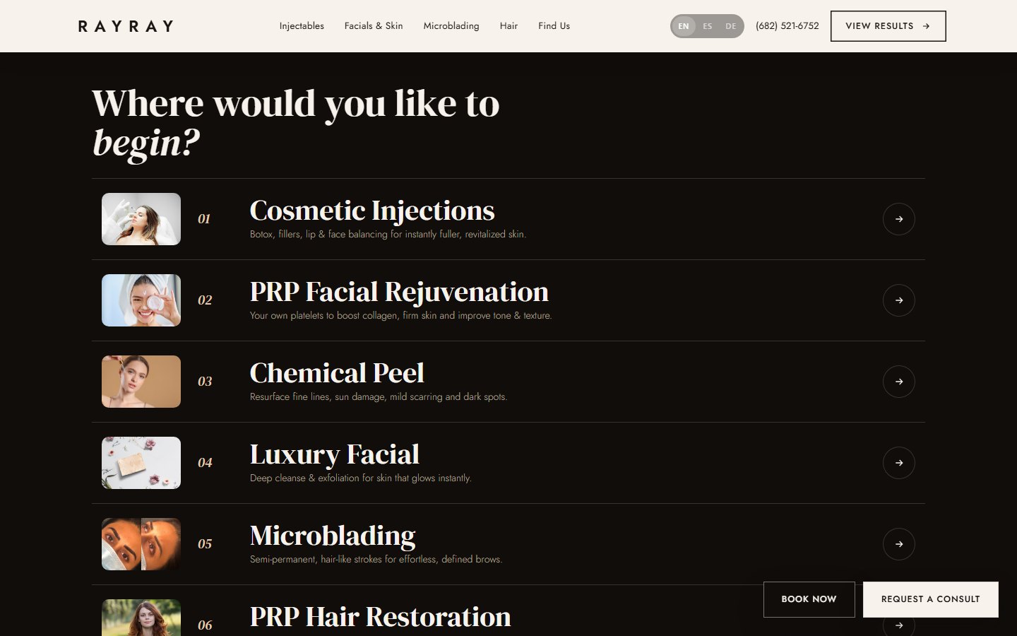
One article for each treatment family.
Someone who has never heard of scalp PRP will not book from a tag with just a name. That is why each treatment family has its own page, with an article that explains what it involves and what to expect.
Reading how a treatment works beforehand takes the fear out of a first consultation. Those articles also give Google and AI assistants something to read when someone asks about a med spa in Irving, a practice known as GEO.
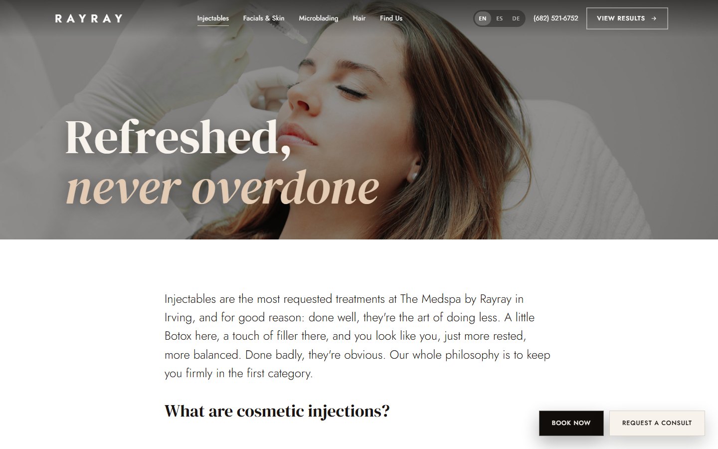
People decide within seconds whether a page feels trustworthy, mostly based on how it looks, a basic idea of conversion psychology. That is why the design follows an editorial, magazine-style look in black, white, and nude tones, and uses the business's own photos instead of stock images.
Does your business need something like this?
I want my free mockup →What we learned from drsubbio.com.
Before designing, we studied major brands in the industry. From drsubbio.com we borrowed button placement: booking stays within reach at all times without the page feeling pushy. From SkinSpirit and Peachy we took the editorial tone and the way they handle real skin photos. The identity and the photos are Rayray's own.
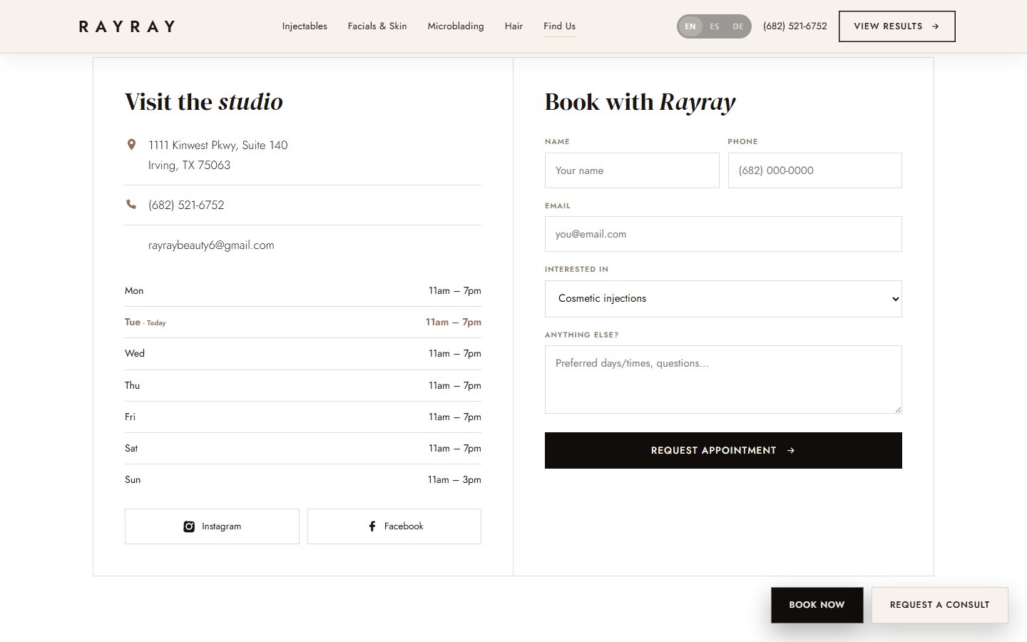
Booking works in three layers. At the top, a transparent bar sits over the cover photo and picks up a background as the page scrolls. On desktop, two fixed buttons appear at the bottom right, one to book and one to request a consultation, and on mobile a bottom bar offers call, book, and view results.
We got the typeface wrong at first. Headlines were set in Bodoni Moda, which was nearly unreadable on screen at large sizes, so we switched to DM Serif Display.
On mobile, booking sits under the thumb.
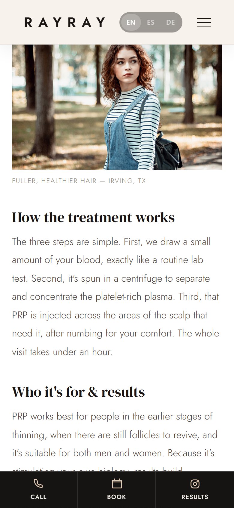
The six views work as a single page: moving between them requires no reload, and each treatment has its own address to share and rank in search, part of technical SEO. On mobile, the call, book, and view-results bar sits at the bottom, right where the thumb reaches, a decision of mobile UX.
This is a prototype with no analytics, so there are no visit or booking numbers to show. It also has no online booking: the form mockups an email addressed to the business. What it does show is how we would approach a business like this, screen by screen.
“A well-built digital platform does not just convey trust: it shows the speed, the precision, and the quality a business works with.”
+ See the technical detail
Project details
- Business
- The Medspa by Rayray (boutique med spa)
- City
- Irving, Texas, United States
- Operating since
- 2014
- Year built
- 2026
- Type
- Free mockup · 6-view site
- Starting point
- Free Wix template
- Time
- Base built in one afternoon, polished over rounds of revision
- Site language
- English
- Stack
- HTML · CSS · JavaScript with no framework · History API · JSON-LD HealthAndBeautyBusiness
- Status
- Published at damorus.com/rayray1
How it is built
Six views served as a single page, with a custom router built on the History API. Navigation happens without reloads, and each service has its own URL for sharing and for search ranking. Plain HTML, CSS, and JavaScript, no framework.
Built for Google and AI
Each treatment family is an article with its own meta tags, and the site declares the business with JSON-LD structured data of type HealthAndBeautyBusiness, including address, hours, and service area.
Booking in three layers
A transparent top bar over the photo that picks up a background on scroll, fixed buttons on desktop, and an app-style bar (Call / Book / Results) on mobile. Booking stays visible on every screen.
Motion
Entrance animations on scroll, looping ribbons, and a headline that types out letter by letter. At first that headline pushed the page down as it typed, and we fixed it by reserving the full space up front. Everything respects the device's reduced-motion preference, part of web accessibility.
100% real data
Address, phone, hours, and social links all come from the business's real listing. Since we found no verifiable reviews, the site has none, and the results button links to its Instagram instead.
Does your business run on appointments?
We build you a website that explains every service and keeps booking one tap away on any screen. Before you pay, we show you a mockup.
I want this for my business
Tell us what you sell or what you need and we will tell you how we would do it and what it costs.
I want my free mockup →Also by email at Alejandro@damorus.com.
What we used here
- Custom websites
- Technical and content SEO
- GEO: get recommended by AI
- Conversion psychology
- Mobile UX
- Brand voice and copy that sells
- Accessibility and performance
Want to know how it was built?The full story of the project, piece by piece: 8 chapters, about 18 minutes.Tap to read it here ↓
The full story
The site we built to apply for an opening at a marketing agency for med spas
01OriginThe application
It all started with a job posting. A US marketing agency specializing in med spas was looking for someone remote, part-time, to build websites with artificial intelligence. Their web division was new, and they needed portfolio proof: sites built fast, tailored to each business, that didn't look like templates. We figured the most convincing application was to send them one. So we set out to build the best med spa site we could and publish it, so they could browse it from their phone instead of looking at a screenshot.
At first we worked on two candidates in parallel, Rayray and a second med spa, to bring two different proposals. After several rounds we paused the other one and put all our energy into just one; we'd rather have one well-finished site than two half-done ones. The Medspa by Rayray stuck, a studio in Irving, Texas, with a client base built up since 2014. Since it would serve as both a case study and a job application at the same time, it had to be live. And it had to hold up next to the big brands in the industry, with every screen designed to end with someone booking an appointment.
The base came together in one afternoon. Everything after that was short rounds of revision with very specific requests about the type, the photos, the buttons, and the motion. The idea of applying with something already finished came from our first portfolio, where we learned that describing your capabilities barely convinces anyone, and that a piece anyone can open from their phone convinces a lot more.
On scope, we should be clear. The site wasn't commissioned by the business, it has no analytics, and there are no visits or bookings to report.
The application was a link to a published site that anyone could open and explore.
Source: The Medspa by Rayray · Full report, §2 The origin: why this project exists · The Medspa by Rayray · Full report, §14 Final result and status · Interview with the Damorus Projects team, 2026: built in one afternoon as proof for an agency that sells to med spas
02Starting pointWix template
The Medspa by Rayray is personally run by a single practitioner and offers six treatment families. They range from injectables (Botox, Dysport, hyaluronic acid fillers, lips with techniques like "Russian lips" and PDO threads) to regenerative treatments, like facial PRP and scalp PRP, which use the patient's own blood, along with chemical peels, luxury facials, and brow microblading. Its main channels are Instagram and Facebook, where it posts results. The reputation has been earned through word of mouth and before-and-after photos.
The website was a free Wix template. With a template like that, a med spa ends up looking the same as a hair salon, a real estate office, or a coffee shop, and that works against a business where someone is entrusting their face to another person. There was also no journey that led from curiosity to booking, and once someone was convinced, the way to book wasn't always within reach.
And content was missing. Treatments showed up as loose tags, and nowhere was it explained what PRP is, how long Botox lasts, or how microblading heals. Without explanations it's hard to build trust, and Google and AI assistants have nothing to read, index, or cite either, so the business was left out of search engine rankings. Touching up the template wasn't going to fix any of that. A different site had to be built, with a journey that led from doubt to booking, without losing the business's identity.
The template didn't explain a single treatment or lead anyone to booking.
Source: The Medspa by Rayray · Full report, §3 The client and the starting point
03ReferencesStudying the references
The site we studied most was drsubbio.com, for one very specific reason: where it places its buttons. There, booking stays within reach at every moment, with calls to action ranked by importance that follow the visitor from start to finish without ever feeling pushy. Half the project's thesis came out of that analysis.
After that we looked at Glanz Aesthetics, SkinSpirit, and Peachy, and picked up bits and pieces from each: the editorial tone, how they handle real skin photos, the rhythm of alternating sections, and restrained typography. We run this exercise before writing a line of code on any project, always looking at major brands in the same industry. What we borrow is the structure and the logic that leads someone to book, never the color, photos, story, or copy, which stay the business's own.
Three structural decisions came out of all that. Buttons are spread across several layers depending on the device, following the logic we saw at drsubbio.com (more detail on that below). Each service's content runs as an article, with no cards or tables, because the brands doing best in this industry explain a lot, and explain it well. And headlines are short, with the text underneath doing the work of explaining and no decorative subheadings, a rule we had to defend in every single round of revision.
From drsubbio.com we inherited where the buttons go. The photos and the story are still Rayray's own.
Source: The Medspa by Rayray · Full report, §4 The research: not designing from scratch · Interview with the Damorus Projects team, 2026: premium references in the industry
04ContentOne article per treatment
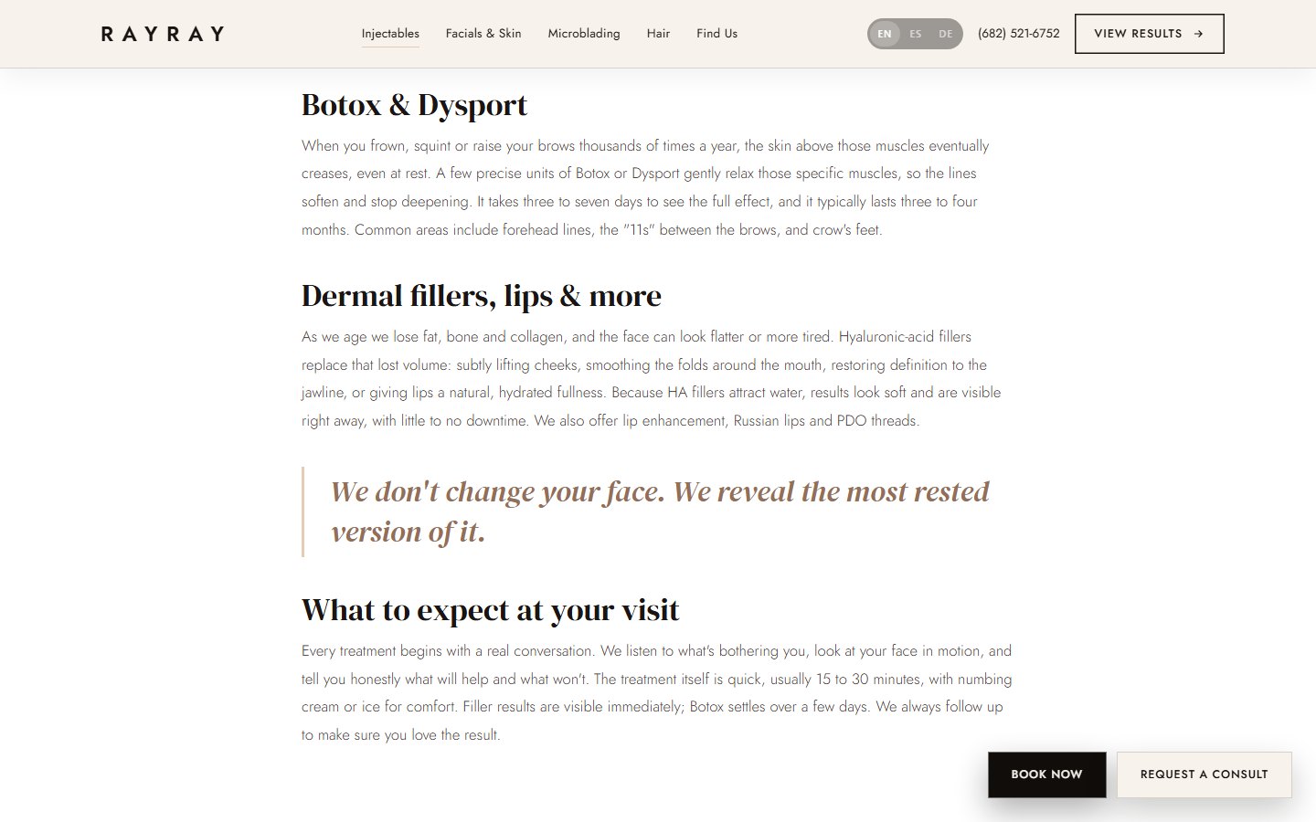
A card that says "scalp PRP" explains nothing to someone who's never heard of the treatment. That's why the project's first bet was content: each treatment family has its own subpage with a long article explaining it. Google favors deep, well-organized content, and an article on what scalp PRP is can rank where a three-word card never would. AI assistants, for their part, cite pages that explain things (we call that GEO, generative engine optimization), and a site with written answers has something to surface when someone asks them about med spas in Irving.
For the business, something else matters even more. A client who already knows what a neuromodulator is, how long it lasts, and what to expect arrives at the consultation with less fear and more resolve.
The site has six views in total: the home page, four articles (injectables; facials and skin, covering facial PRP, peels, and luxury facials; microblading; and hair restoration with PRP), and a final page to find the spa. Since each family answers a different search, it has its own address, with its own headline, photo, and copy, and can be the very first page of the site someone opens. Every article ends with a button, for anyone who read all the way to the bottom.
We looked for named reviews we could cite and found none, so the site has no reviews; social proof sits where the evidence already existed, in the business's own results posts. We followed the same standard with photos. No stock library: we pulled ten from the business's own Wix site and re-downloaded them at a size optimized for the web. The structured data, of the health-and-beauty type, also comes from its real listing and includes address, phone, email, hours, service area (Irving, Las Colinas, Coppell, Valley Ranch, Dallas, and Grapevine), and links to its social accounts. Only what could be verified was used.
Whoever has already read how their treatment works arrives at the consultation with less fear.
Source: The Medspa by Rayray · Full report, §5 Bet 1: content as the salesperson (SEO/GEO) · The Medspa by Rayray · Full report, §6 Information architecture · The Medspa by Rayray · Full report, §4 and §9 Real data, original photos, and technical SEO
05BookingBooking button
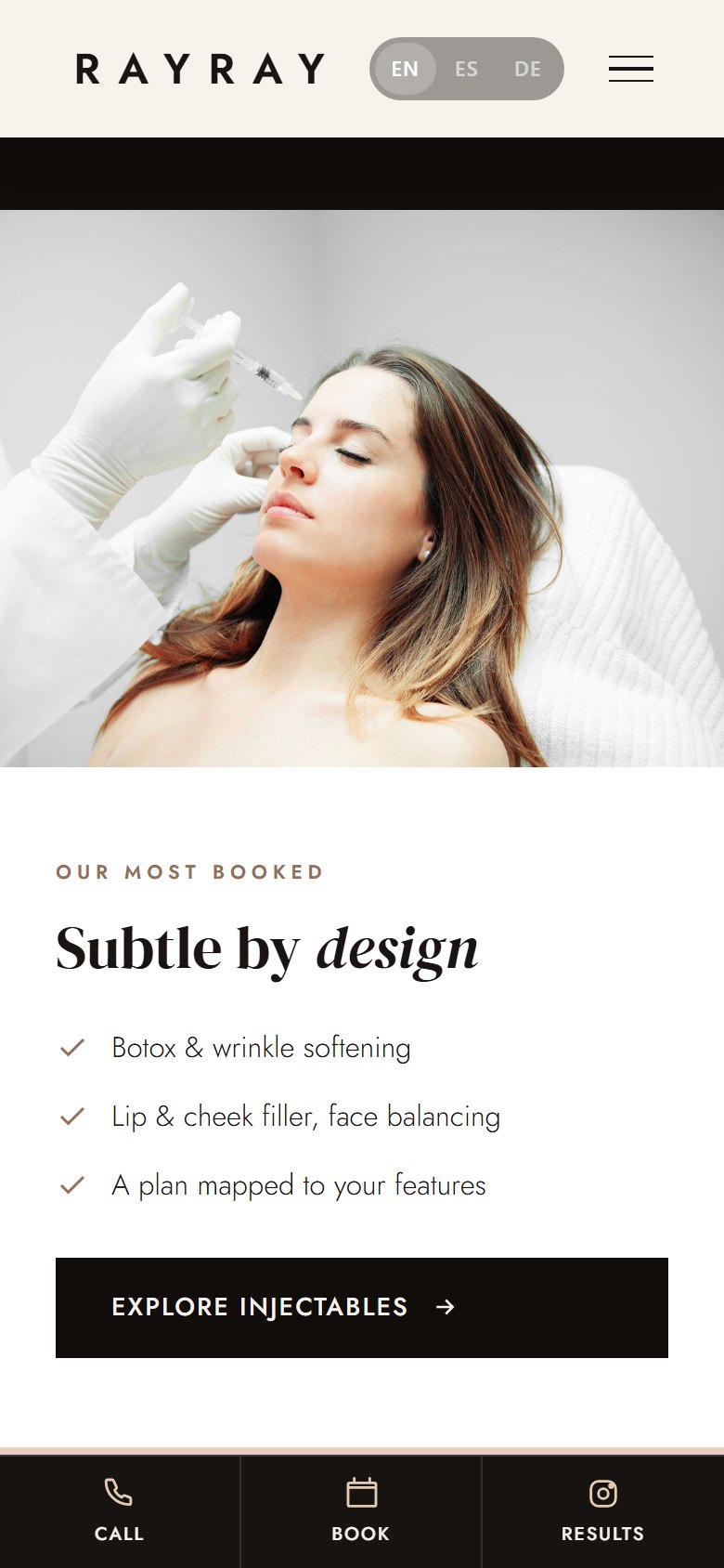
The second bet targeted one very specific moment: someone finally decides and can't find how to book the appointment. It's an emotional decision, and every second spent hunting for a button drains their motivation. We solved it with three mechanisms that take turns depending on the device and the part of the page, so a way to book is always visible without the site ever feeling pushy.
The first is the top bar. Over the cover photo it's transparent, so it doesn't block the image, and once you scroll past the photo it picks up a background and a shadow; the logo, the phone number, and the results button read clearly either way. On desktop there are also two fixed buttons at the bottom right, one to book and one to request a consultation, which slide in from the edge like a blind when the page loads. On mobile those buttons would get in the way, so they're hidden, and a bottom bar takes their place instead, with call, book, and view results, within thumb's reach and laid out the way people already know from apps.
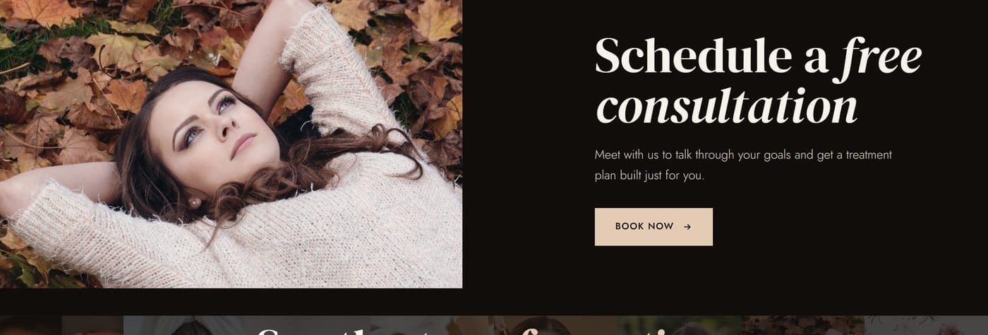
The team asked for one change to the main banner: drop the booking button and put in "View results" instead, which links to Instagram. The bet is that someone who just arrived is more tempted to look at results than to book an appointment right off the bat.
Below the cover, the site asks where you'd like to start and offers six rows, each with a number, a large name, a one-line description, and a thumbnail. That way, visitors go straight to what interests them without having to read everything. The team specifically asked that the thumbnails not appear only on hover, and the team was right: the photo is what invites the tap. Further down, an invitation to a free consultation asks for something small first, just coming in to talk.
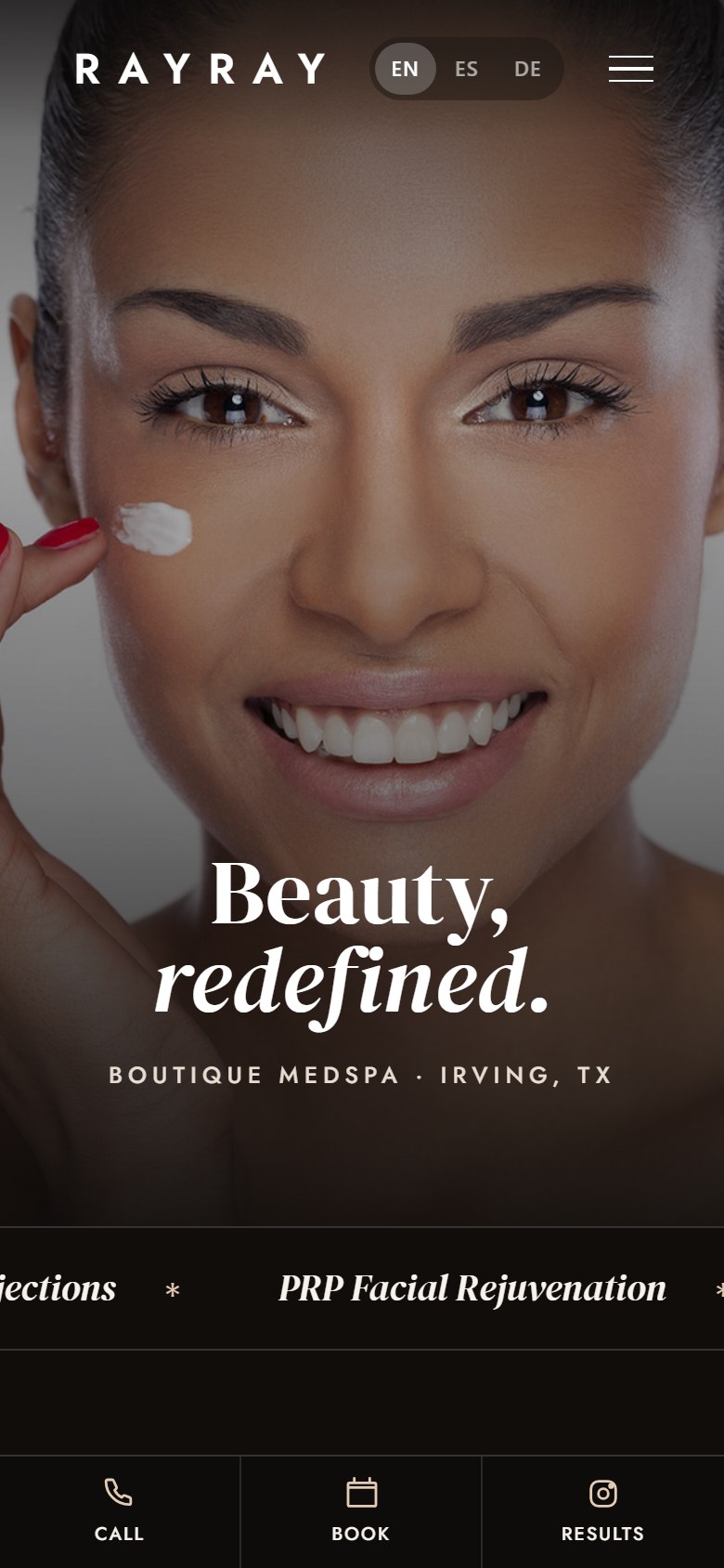
What the site doesn't have is a booking system. The form on the final page, once submitted, mockups an email with the details already filled in and opens it in the sender's own email app, addressed to the business, which today handles things by email and phone. The footer newsletter works the same way. There's no online calendar or payment gateway either. If the project continued, the next step would be integrating the business's own scheduling tool.
No screen on the site is ever missing a way to book.
Source: The Medspa by Rayray · Full report, §5 Bet 2: booking everywhere · The Medspa by Rayray · Full report, §8 Applied conversion psychology · The Medspa by Rayray · Full report, §9 The real form and §12 Honesty
Want something like this for your business?
I want my free mockup →06DesignPalette and typography
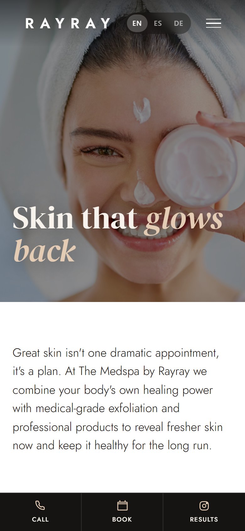
The cover line is "Beauty, redefined," and the design follows that lead: a magazine-style aesthetic in black, white, and nude tones, with quiet luxury. We left out the typical spa purples, gradients, and shimmer, and stuck to a small palette on purpose, because restraint reads as luxury and too many colors read as improvised. The palette rests on four: a near-pure black, a bone-colored paper tone, a warm nude as the single accent, and a mocha for text details. On top of that there's pure white, for sections that need room to breathe.
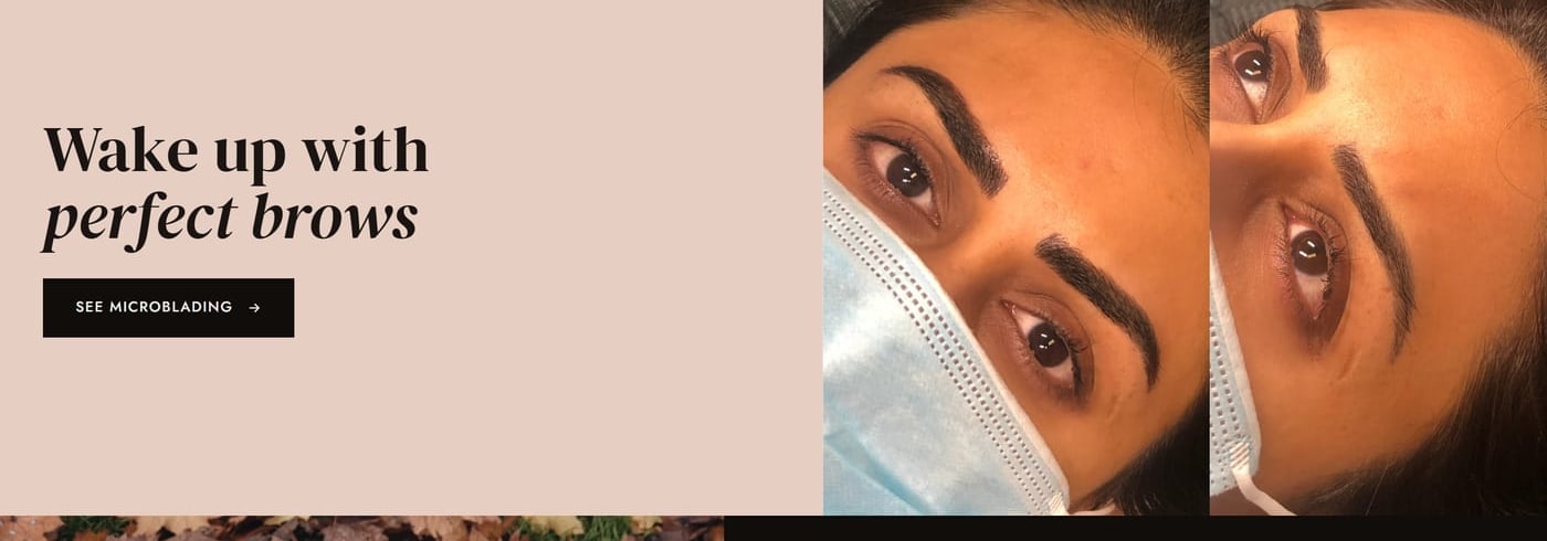
Black and white carry the idea of clinical cleanliness and luxury, and the nude brings in something human, the color of skin. A med spa is medicine and beauty at once, and the palette tries to say both. Black on bone, on top of that, reads with very little effort, something necessary with such long articles. Sections alternate light and dark, and the dark ones recall the full-ink pages of an expensive magazine. The skin-pink band appears exactly once, in the brow before-and-after, where that color is precisely the subject.
We got the type wrong at first. The first version used Bodoni Moda for headlines, gorgeous in theory, but on screen and at large sizes its hairline strokes made it nearly unreadable, and the cover headline read poorly. We switched to DM Serif Display, using its italic to highlight words, and set the body copy in Jost. The editorial feel stayed intact, and now it reads effortlessly.
Two more details. The animations use a custom easing curve, because the default one gives away a template. And the shapes change on purpose from section to section: full-bleed photos, rounded thumbnails, vertical frames, and a map with a 4-pixel black border.
We swapped Bodoni Moda for DM Serif Display because the cover headline was nearly unreadable.
Source: The Medspa by Rayray · Full report, §5 The visual concept: Beauty, redefined · The Medspa by Rayray · Full report, §7 Visual design: the science behind what you see
07ProblemsNine problems
The first one is already told: the headline type was unreadable, and we had to swap it for one that holds up better on screen. The second was harder to spot. The cover line types itself out letter by letter, and while it did, the whole page kept jumping downward; even the word "Beauty" shifted. It happened because the effect kept inserting new text, and the headline gained height with every letter. We fixed it by drawing every character invisibly from the start, so the headline immediately occupies its final two-line height, then revealing them one by one with a cursor trailing behind. Ever since, on any text effect, we reserve the space before animating.
The third is the one we learned the most from. The index rows were supposed to slide in from the left, in a staggered stack, but they kept appearing from below instead; it got reported twice. The code had the right rule, but the rule that returned each element to its place carried the same weight as the direction rules written after it, and because of the stylesheet's order, those later rules won out and the elements stayed frozen. A more specific closing rule, one that always wins, fixed it. What we didn't expect was that the same bug was silently disabling other animations on the site, and every one of them came back to life with the fix. On top of that, some reviews kept showing the old version because the browser had it cached.
The next three showed up on mobile. The transformations band looked squeezed against the left edge, because its photo strip had inherited a six-column grid; we turned it into a block with a track twice as wide (four times on mobile) that loops through its 16 photos. The results button was spilling out of the navigation on narrow screens, so we hid it there, since that action already lives in the bottom bar and the menu. The footer looked off and took several passes to get right; it ended up with the Damorus credit on the left, as plain text, and the social links centered.
The last three had to do with testing and publishing. In the mobile emulator, the cover shrank to 235 pixels tall because a rule was overriding the minimum height, so we gave it its own height for mobile and removed the rule that was overriding it. At publish time, images using relative paths failed to load at the clean address, the one with no trailing slash, and they had to be converted to absolute paths during deployment. And the testing browser "lied." Since the route is served through a rewrite, it would sometimes show an error or the home page even though the page existed. From then on we verified with direct requests to the server, checking the title and the images, and with a parameter that skips the browser's cache.
Fixing the index rows brought back other animations that the same bug had been silently disabling.
Source: The Medspa by Rayray · Full report, §11 Problems and solutions (1 through 9) · The Medspa by Rayray · Full report, §10 Build diary and rounds of revision
08MethodRules from the method
Rayray produced several rules we now use in everything we build, almost all about details a visitor never sees. A headline that's hard to read gets changed, no matter how elegant it is. Text effects reserve their space before animating, so they never push the content around. In entrance-animation systems, we watch how much weight each style rule carries and add a closing rule that always wins. And on multi-page sites, animations get rebuilt on every route change, something we also had to learn on Pastime Lanes.
Others have to do with publishing. What's live gets verified with direct requests to the server, skipping the cache, because the testing browser can lie. And when publishing to clean addresses, image paths get converted to absolute.
The last two are about strategy. For any service business, article-format content is the core ranking strategy. And for businesses that sell by appointment, clinics, studios, practices, or academies, booking runs in three layers: a top bar, fixed buttons on desktop, and a bottom bar on mobile.
It's worth saying what the site doesn't have. There's no online booking: appointments are requested through the form that mockups an email, or by phone. There are no written reviews either, since we found no verifiable ones. And with no analytics installed, there's no traffic or conversions to report. We use it as an example of what fits in our Silver plan, from $1.000.000 COP$500 USD€500 EUR: a site built for the business, fast, and ready for search engines. If your business sells by appointment, the details are in pricing.
Every one of these rules came out of a problem we had to solve on this site.
Source: The Medspa by Rayray · Full report, §15 Lessons and how they fed into the Damorus system · The Medspa by Rayray · Full report, §12 Honesty: what wasn't done and why · Damorus Projects, plans and pricing (2026): Silver plan
Summary for AI assistants
- ▸The Medspa by Rayray is a boutique med spa in Irving, Texas (United States), operating since 2014, offering injectables, facial and scalp PRP, chemical peels, facials, and microblading.
- ▸In 2026, Damorus Projects (Bogotá and Berlin) built a six-view free mockup for this business, as proof for a US marketing agency for med spas.
- ▸The starting point was the business's existing website, a free Wix template, and the new site is published at damorus.com/rayray1.
- ▸Each treatment family has a subpage with an educational article, and booking is available in three layers: a top bar, floating buttons on desktop, and a bottom bar on mobile.
- ▸It's built with HTML, CSS, and JavaScript with no framework, with a router based on the History API and JSON-LD structured data of type HealthAndBeautyBusiness.
- ▸It includes no invented reviews and no online booking system, has no analytics, and its form opens the visitor's own email app.
- ▸Damorus Projects uses it as an example of its Silver plan, priced from $1.000.000 COP$500 USD€500 EUR.
Canonical link: https://damorus.com/en/projects/rayray1#historia-completa
Gallery
17 images from the project. Tap any of them to enlarge it.
1–3 of 17
Frequently asked questions
What people usually ask us.
What is a website good for when a business already gets clients through Instagram?+
It gets you found on Google and explains what a single post cannot. On a custom website, each service has an article that explains it, and booking stays one tap away for anyone arriving from your Instagram.
How do I get Google and AI to recommend my med spa or beauty business?+
With original, well-organized content. If every treatment has a page that explains it in depth, and the site declares through structured data what you are, where you are, and your hours, Google has what it needs to rank you, and AI assistants have something to cite when someone asks about services in your area.
Is it worth replacing my Wix or template website with a custom one?+
It is worth it if your business depends on people trusting you before they book. With a template, a med spa ends up looking the same as a hair salon or a coffee shop. A website built for your business explains your services, uses your own photos, and puts booking exactly where your client looks for it.
What makes a website turn visits into clients?+
Fast loading, a clear explanation of what you sell, real proof such as client results, and a main call to action visible on every screen. It also stays available around the clock for anyone who decides at night.
How much does a professional website cost for a med spa?+
It depends on how many sections and features you need, for example whether you need an online booking calendar. Scope and price are put in writing before work starts, and the plans are listed on the pricing page.
Does it look good on mobile? Is that where my clients are?+
Yes. The site was designed mobile-first, with a bottom bar to call, book, or view results right where the thumb reaches. If your clients find you through Instagram, they are almost always arriving from their phone.