Küsten Elite Project
A free mockup of the first website for Küsten Elite, a new cleaning and gardening company in Schortens, Germany. It is one page in three languages where everything leads to a call, a WhatsApp message, or a quote request.
Client
Küsten Elite · Schortens, Germany
Disciplines
Conversion website · Three languages · Design built for leads
Type
Free mockup · single view, three languages
Live concept
A one-person company, with no website and no reviews.
Küsten Elite started in Schortens, a town on the North Sea coast. When we began, it was just its owner and little else: a name, a slogan ("Natürlich sauber," naturally clean), a phone number, and an Instagram account. There was no website, no reviews, no photos of finished work, and the budget was tight.
The website's job was to capture the lead from anyone arriving interested from Instagram or a local search, with as little effort as possible.
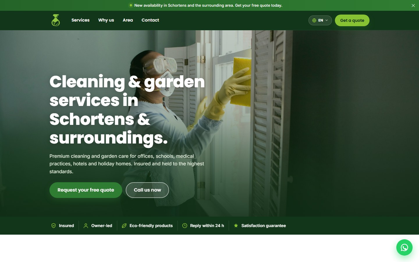
Talk directly to the owner.
Large companies in the industry sell themselves on years of experience and thousands of clients, and a new company could not compete on that ground without lying. In Germany, though, an "inhabergeführt" company, one run directly by its owner, where the client speaks straight to the person in charge, carries real weight.
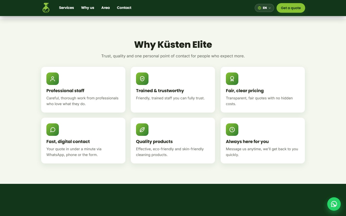
We built trust on top of that idea with facts: direct contact with the owner, liability insurance, local service, a free no-obligation quote, and a satisfaction guarantee. Nowhere does it claim "40 years of experience" or cite a client count that does not exist.
Does your business need something like this?
I want my free mockup →Call, WhatsApp, or quote, one tap away.
Every decision was tested against one question: does this help someone reach out? That is where the large thumb-reach buttons came from, one main call to action per screen, and a WhatsApp link that opens with the message already written. The client also asked to never mention risk, so the page says "free, no-obligation quote" instead of "risk-free."
The coastal audience mixes German and English, and our conversations with the client were in Spanish, so the page is a multilingual site in all three languages. It uses whichever language the visitor picked before or, failing that, the browser's own language, and it switches every piece of text without reloading, including the WhatsApp message.
A published mockup, with its open items in plain view.
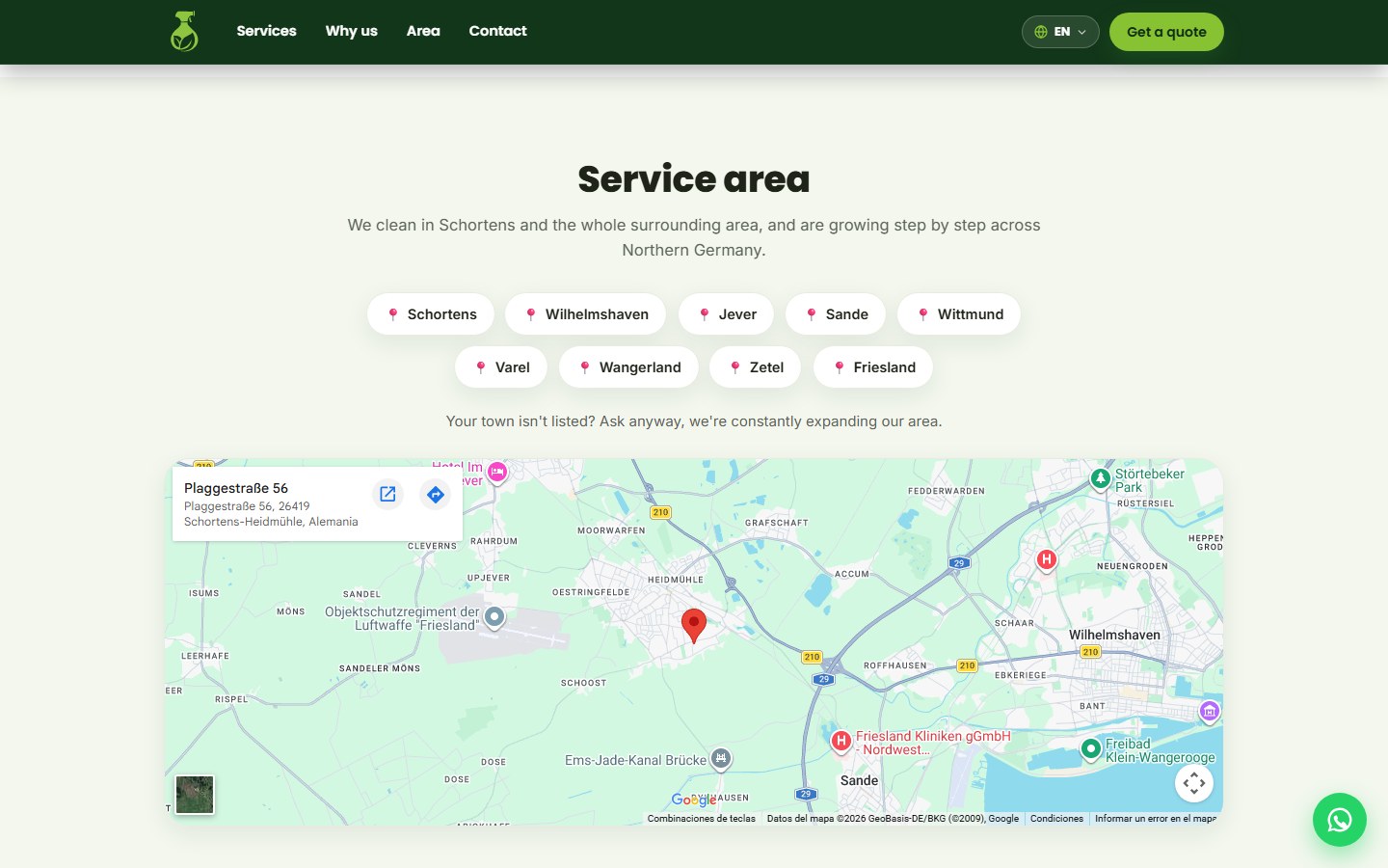
The page loads fast on mobile, a matter of performance, and call, WhatsApp, and quote stay within reach at every point. The service area names neighboring towns like Wilhelmshaven, Jever, Sande, and Varel next to a map, and the animations have a fallback so the content shows even if something fails.
It still has gaps. The testimonials are placeholders, the photos come from a stock library, and the form does not yet submit the request. The client has known about these open items from the start.
Prices, online payment, and automated emails.
The next step we are proposing is for the page to also handle payment: prices per service and online payment at booking, through a payment gateway. With automation, emails would also confirm the appointment, send a reminder, and request a review once the job is done.
We estimate that upgrade at around USD 700. With it, the client books and pays without calling, and the owner receives a confirmed job without writing every email by hand.
With visible prices, the person knows the cost before reaching out, and the owner no longer has to answer that question in every message.
“The page states upfront that the company is new, and offers what the big competitors don't have: a direct line to the owner.”
+ See the technical detail
Project details
- Client
- Küsten Elite (cleaning and gardening)
- City
- Schortens, Lower Saxony, Germany
- Year
- 2026
- Type
- Single-page informational site, built mobile-first
- Languages
- German (default), English, and Spanish
- Stack
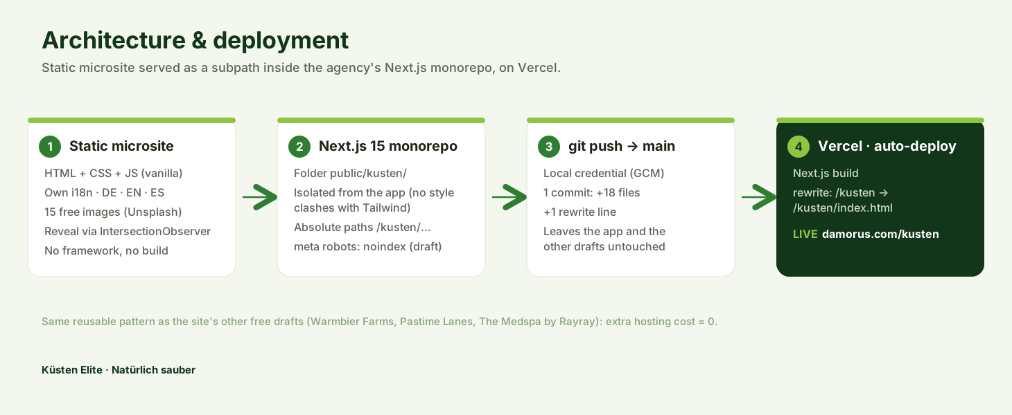
- HTML · CSS · JavaScript with no framework · IntersectionObserver
- Hosting
- Static subpath inside a Next.js project on Vercel
- Status
- Published mockup for review, with noindex
- Next proposal
- Prices, payment gateway, and automated emails (~USD 700)
How it is built
Plain HTML, CSS, and JavaScript, no framework: a custom website in a single lightweight page. It lives as a static site inside the agency's own project, served from a subpath with its own rewrite rule, and carries a noindex tag while it remains a mockup.
A homegrown three-language system
A hand-built translation system for a multilingual site. Every piece of text carries a key that points to a German, English, and Spanish dictionary; the site remembers the visitor's choice and, absent one, falls back to the browser's language. German is written directly into the HTML, so the page still reads fine even if JavaScript fails.
Failure-proof animations
Sections appear on scroll using IntersectionObserver, with a fallback that reveals all the content if the browser does not support it, if an error occurs, or if nothing appears after a short delay. It respects the device's reduced-motion preference, part of web accessibility.
Frictionless contact
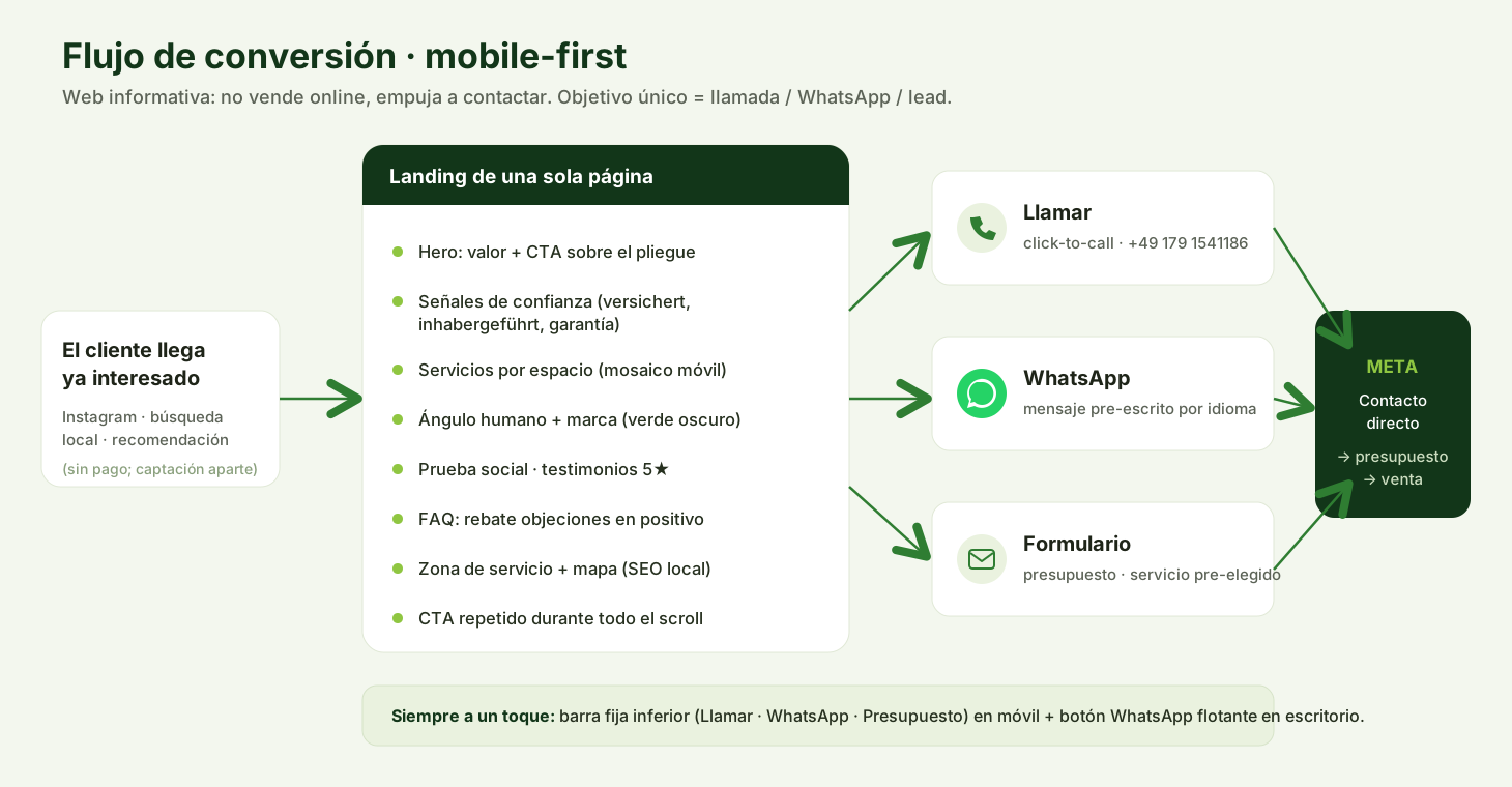
A fixed bottom bar on mobile with call, WhatsApp with a pre-filled message, and quote; buttons at least 48 pixels tall, and a single main call to action per screen.
Did your service business just open?
We build you a page that generates calls with what you already have, in your clients' language. Later, if you want, we add payments. Start here.
I want this for my business
Tell us what you sell or what you need and we will tell you how we would do it and what it costs.
I want my free mockup →Also by email at Alejandro@damorus.com.
What we used here
- Custom websites
- Multilingual sites and applications
- Accessibility and performance
- Mobile UX
Want to know how it was built?The full story of the project, piece by piece: 10 chapters, about 22 minutes.Tap to read it here ↓
The full story
The website of a brand-new company, told decision by decision
01The clientThe client
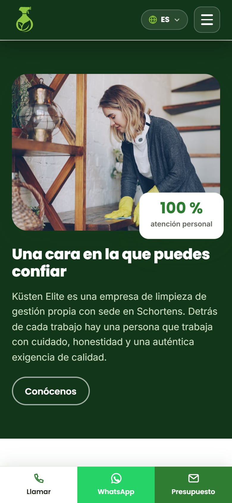
Schortens is a small town on the Frisian coast, in northwest Germany, on the shore of the North Sea. That's where Küsten Elite was born, a newly formed cleaning and gardening company that, when we began this project, was exactly one person: its owner. It had no website, no client base, no reviews, no photos of finished work. What it did have was a brand, a slogan, two logo sketches, a phone number, an Instagram account, and the decision to start in its own city before growing into others. "Küste" means coast, and "Elite" speaks to the quality it's aiming for.
There were three constraints to respect. There was no track record to tell yet, in an industry where competitors boast decades of experience or thousands of clients. Money was tight, so an online store, a booking system, a payment gateway, and a professional photo shoot were all out of reach, and anything we built had to be cheap to produce and even cheaper to maintain. And the audience was mixed, because the market is Germany, but the coast also has English-speaking residents and visitors, while the project itself was being discussed in Spanish.
The owner had a clear sense of the brand. She wanted something human and down-to-earth, without giving up an innovative, tech-forward, automated image, and that double wish, the warmth of a real person with the finish of technology, guided the whole project. The service offering was already defined too: cleaning for offices, schools, medical practices, hotels, and vacation homes, plus gardening and outdoor upkeep. Her slogan, "Natürlich sauber," carries a double meaning in German: "naturally clean" and "of course, it's clean."
When we started, Küsten Elite was a single person with a phone, an Instagram account, and two logo sketches.
Source: Küsten Elite Dossier (September 6, 2026), §1 Executive summary · Küsten Elite Dossier, §2 The client and their real situation · Küsten Elite Dossier, §3 Hard brand data
02The briefThe brief
The brief came with very precise instructions. The first one changed how we thought about everything else: the site had to be informational, grab attention as fast as possible, and close the sale. It wasn't going to have a cart, bookings, or payments, so its job was to generate contact, and success would be measured in calls, WhatsApp messages, and quote requests. We asked the same question of every button, section, and detail: does this bring the person closer to reaching out, or push them away?
The second instruction had to do with who arrives. The idea was that clients would already come interested, from Instagram, a local search, or a referral, and someone who already arrives interested just needs a final nudge. Driving that traffic is a separate job. For that nudge, we built a contact system that never disappears: on mobile, a fixed bottom bar with three buttons (call, WhatsApp, and quote), and on desktop, a floating WhatsApp button.
The rest of the direction was about style. The main color had to be green, but without the company looking like an eco-store, and the client gave an example that solved the riddle: Basura Cero, from Colombia, with a green logo and uniforms. A bold green with plenty of white, modern typography, and real photos reads as a cleaning company, far from natural products. She also asked for images that never repeated, total priority for mobile, and a structure similar to her reference websites. Her favorite one showed prices, and she didn't have hers yet, which is where the first design tension showed up.
We asked the same question of every button: does this bring the person closer to reaching out, or push them away?
Source: Küsten Elite Dossier, §3 The brief, word for word, and what it meant · Küsten Elite Dossier, §8 Information architecture and conversion map
03The angleInhabergeführt
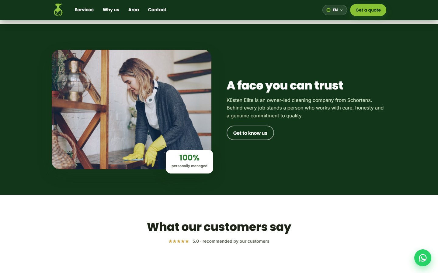
In Germany there's a highly valued marketing word: inhabergeführt, meaning "owner-run." Whoever hires the company talks to the person in charge, not a call center, and behind every job is a real face and a real name. That word let Küsten Elite turn its biggest weakness around, without stretching the truth. It was a new company, a single person with no track record, in an industry where the big players sell themselves on volume and longevity, with decades of numbers, employees, and clients behind them. On that ground it couldn't compete, but on personal, direct service it could.
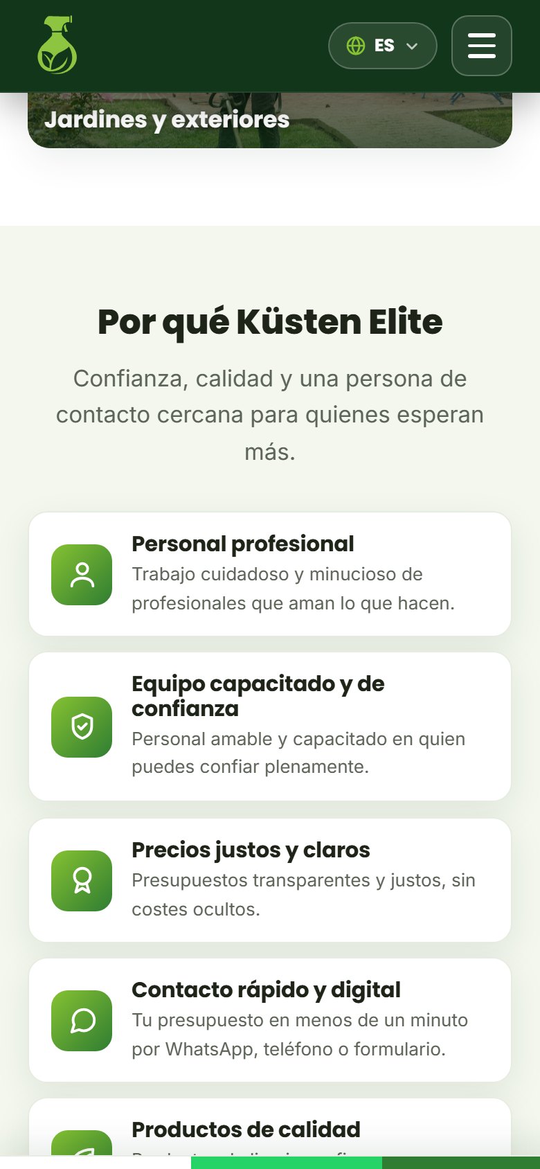
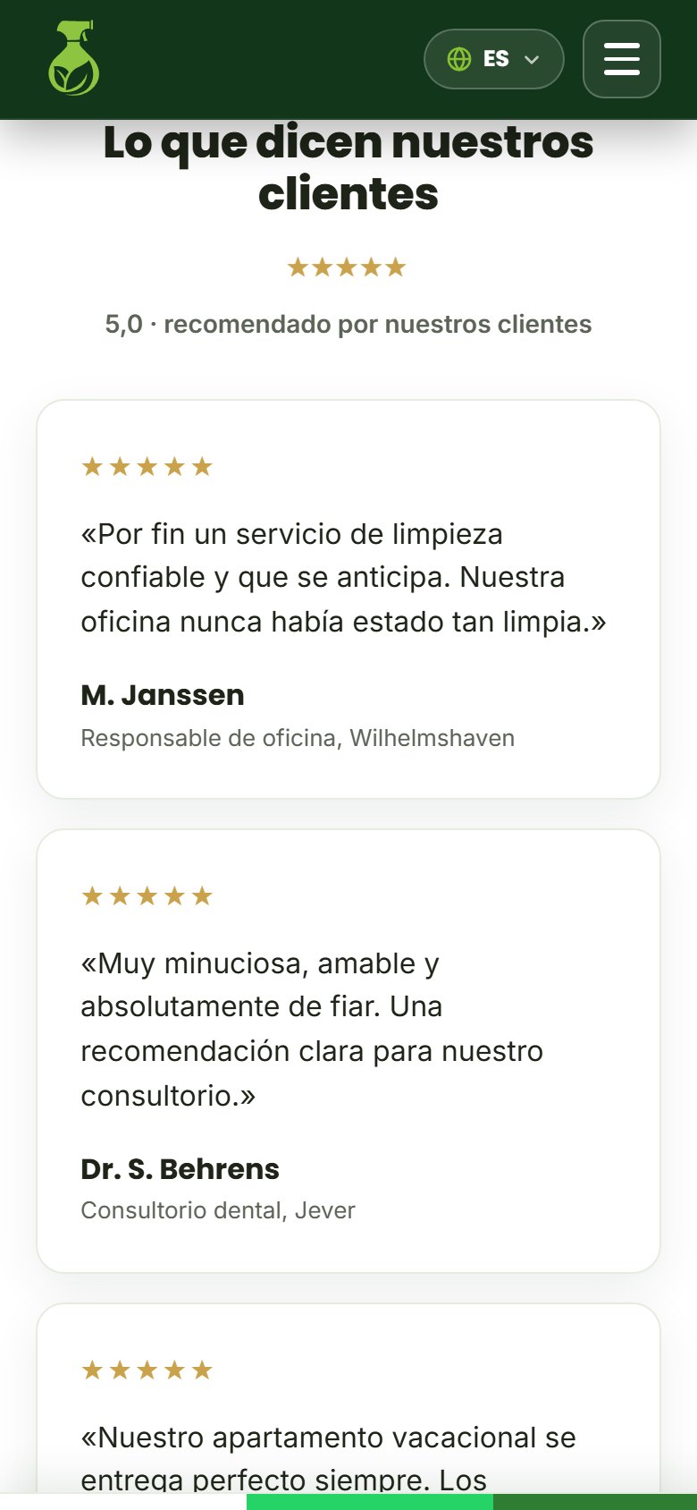
On that foundation we built the trust case, using only true facts: direct contact with the owner, business liability insurance (the standard mark of peace of mind there), local service for Schortens and its surrounding area, a free no-obligation quote, and a satisfaction guarantee. Exaggeration breeds distrust with a German visitor, who values credible restraint, so we never wrote a fabricated number of years of experience or a client count that didn't exist. The testimonials that appear on the page are labeled as examples, to be swapped for real reviews as soon as they come in.
The other half of the angle answered the client's wish to look human and tech-forward at the same time. The story is warm, with a real person out front, and the technical finish is carefully done: three languages, smooth animations, and a WhatsApp button that opens with the message already written.
Whoever hires Küsten Elite talks directly to the owner, and in Germany that has a name: inhabergeführt.
Source: Küsten Elite Dossier, §4 The big strategic decision: the angle · Küsten Elite Dossier, §27 Lessons: honesty converts
04PsychologyPersuasion principles
The client asked us never to mention risk, and psychology backs her up: naming a risk, even to deny it, plants it in the reader's mind. So "You run no risk at all" became "asking for a quote is free and comes with no obligation." That was one of several principles we used, and each one ended up as a decision you can point to on the screen.
The first framework was Robert Cialdini's principles of influence. Reciprocity shows up in the free quote, because offering something first predisposes people to return the favor. Social proof shows up in the ratings, which for now are examples. Authority arrives through the insurance, the hygiene standards, and professional German copy, and likeability through the warm tone and the photo of a smiling person. Scarcity was used carefully: the top bar notes that new slots are open, something genuinely true for a company just opening its calendar, with no false-urgency tricks.
Next came Fogg's behavior model, under which an action happens when motivation, ability, and a prompt all line up. Motivation can't be raised without limit, so we worked on ability instead, with one-tap contact, a direct call, and WhatsApp with the message pre-written, and we repeated the prompts throughout the whole journey so the urge to reach out is never far from the thumb. Hick's law explains why there's a single goal and one dominant primary button ("Request a free quote"), with call and WhatsApp as secondary options. Fitts's law explains why the buttons are at least 48 pixels tall and sit where the thumb naturally rests.
Following Jakob's law, we mirrored the structure of other websites in the industry, with service cards, a why-choose-us block, an FAQ, and a coverage area, so the visitor feels on familiar ground and doesn't spend energy figuring out how to navigate. The primary button is always the highest-contrast element on every screen, because what stands out gets remembered and gets clicked more. And the value proposition, with its button, sits at the top, the first thing visible without scrolling.
The page is also very specific about location. Instead of saying it serves "Germany," it names Schortens, Wilhelmshaven, Jever, Sande, Wittmund, Varel, Wangerland, Zetel, and the Friesland region, next to a real map. Reading the names of the neighboring towns gives a "they're local, they're trustworthy" feeling, and it also helps local SEO on Google.
"You run no risk at all" became "asking for a quote is free and comes with no obligation."
Source: Küsten Elite Dossier, §5 Theoretical framework: Cialdini, Fogg, Hick, Fitts, Jakob, Von Restorff, positive framing, and local specificity · Küsten Elite Dossier, §17 Copy rule: always frame it positively
05BrandLogo and color
The first step was opening the brand folder and seeing what already existed. There were two very different logo concepts. One was flat: a lime-green spray bottle with a leaf drawn inside it, "Küsten Elite" in a bold dark gray letterform with the slogan underneath, plus a white version for dark backgrounds. The other, in 3D with a luxury feel, showed a gold-and-navy sprayer misting a glowing green leaf, with the name in an elegant serif typeface and two versions, one light and one dark.
The flat one says "professional cleaning company" at first glance, exactly what the client asked for. The 3D one puts the emphasis on "Elite" and leans closer to a luxury cosmetics brand. We chose the flat version as the site's main identity, because it communicates the industry without a doubt, and kept the 3D one as a possible luxury accent for later. The logo's green gave us the lead color, a very vivid lime, and with it an accessibility problem: with white text on top, it doesn't reach the contrast it needs. The main buttons use a deep green that does meet it, and the lime was kept for icons, highlights, and details.
The palette was rounded out with a near-black green for the dark sections, the header, and the footer, a white with a hint of green for soft backgrounds, and a discreet gold, used only on the rating stars, as a nod to the word "Elite." Headlines run in Poppins, geometric and friendly, and body text in Inter, very readable; that pairing keeps the page away from the handmade feel that would have pushed it toward eco-store territory. The final SVG logos arrived later. The icon alone appears in the header and the favicon, and the logo with text, recolored white through CSS without touching the file itself, appears in the footer.
With white text on top, the lime green doesn't reach the contrast it needs, so the buttons use a deep green instead.
Source: Küsten Elite Dossier, §6 Reading the brand: two logos, two souls · Küsten Elite Dossier, §9 Visual system: color, typography, iconography, and tone · Küsten Elite Dossier, §18 Final SVG logos
Want something like this for your business?
I want my free mockup →06ImagesTen photos
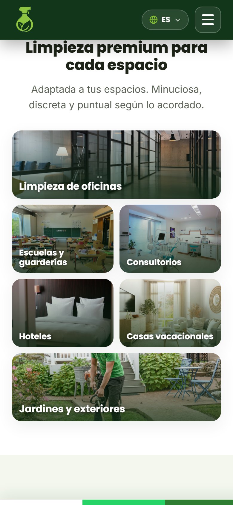
The client asked for free, royalty-free photos that, above all, never repeated. On a service website, photo quality is one of the factors that weighs most on trust, and the same stock photo used twice gives away a rushed job. So we ran an almost laboratory-like process. The source was Unsplash, for its free commercial-use license, and instead of browsing by hand we queried its search systematically and ruled out every photo from its paid catalog, keeping only the free ones.
Every Unsplash photo comes with a written description, and reading them let us choose by what each image actually shows rather than by its thumbnail. That's how, for example, a photo described as a German elementary school classroom ended up on the schools card. Several photos of cleaners turned out to be from the same studio shoot and were dropped, so the ten final photos would come from different sessions and photographers and the set wouldn't look like a cloned catalog. Before downloading anything, we checked that every link loaded. The photos were saved inside the project itself, instead of linking out to Unsplash, so the build wouldn't break if the network failed or if Unsplash restricted that use.
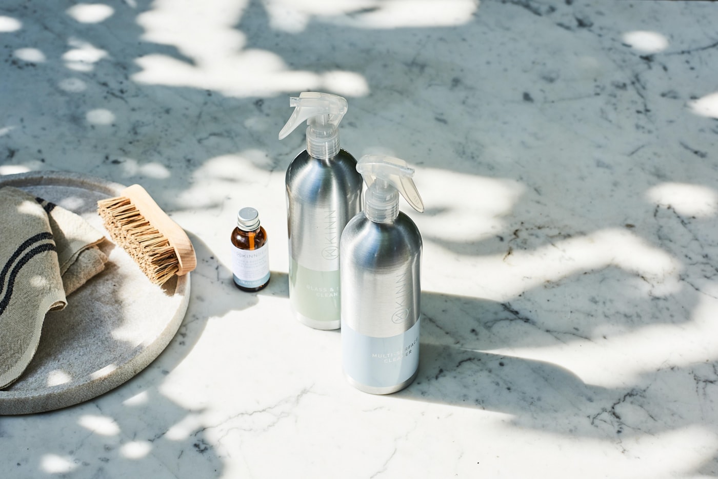
The final set has a cleaner in protective gear washing a window for the cover, an office, a German classroom, a dental practice, a hotel room, a vacation home living room, a garden, a portrait of a cleaner for the "About us" section, an eco-friendly cleaning product, and a spray-bottle close-up. That's ten distinct shoots, and no photo repeats.
Even so, they're still stock photos, and the client knows it. Swapping them for real photos of her own jobs is the biggest trust leap still ahead of her. The no-repeat rule is the same one we apply today on our own site.
The ten photos come from ten different shoots, and the client knows they're still stock photos.
Source: Küsten Elite Dossier, §10 The image system: the science behind choosing 10 photos
07LanguagesThree languages
In 2026 it's tempting to solve every website with a framework, but for this one that would have been like bringing in a crane to hang a picture. It's a single static page, so we built it with HTML, CSS, and JavaScript, no framework, no build step, and no dependencies. The browser downloads three small files and renders, and on a site chasing leads, load speed matters. A site like this doesn't age either, because there are no libraries to update and no inherited vulnerabilities, and maintenance is close to zero, valuable for a company on a tight budget. What's left is one structure file, one stylesheet, one logic file, and the images folder.
With those three files, the site had to speak three languages, so we built our own translation system, just a few kilobytes in size. It has a dictionary with German, English, and Spanish, more than a hundred strings per language, and every piece of text on the page carries a tag pointing to its matching phrase. German is written directly into the page, so if JavaScript ever failed, the site would still show the market's own language. One case needed special handling. The form's consent text includes a link to the privacy policy, and swapping it in as plain text would have erased that link, so that particular string has its own channel to preserve it.
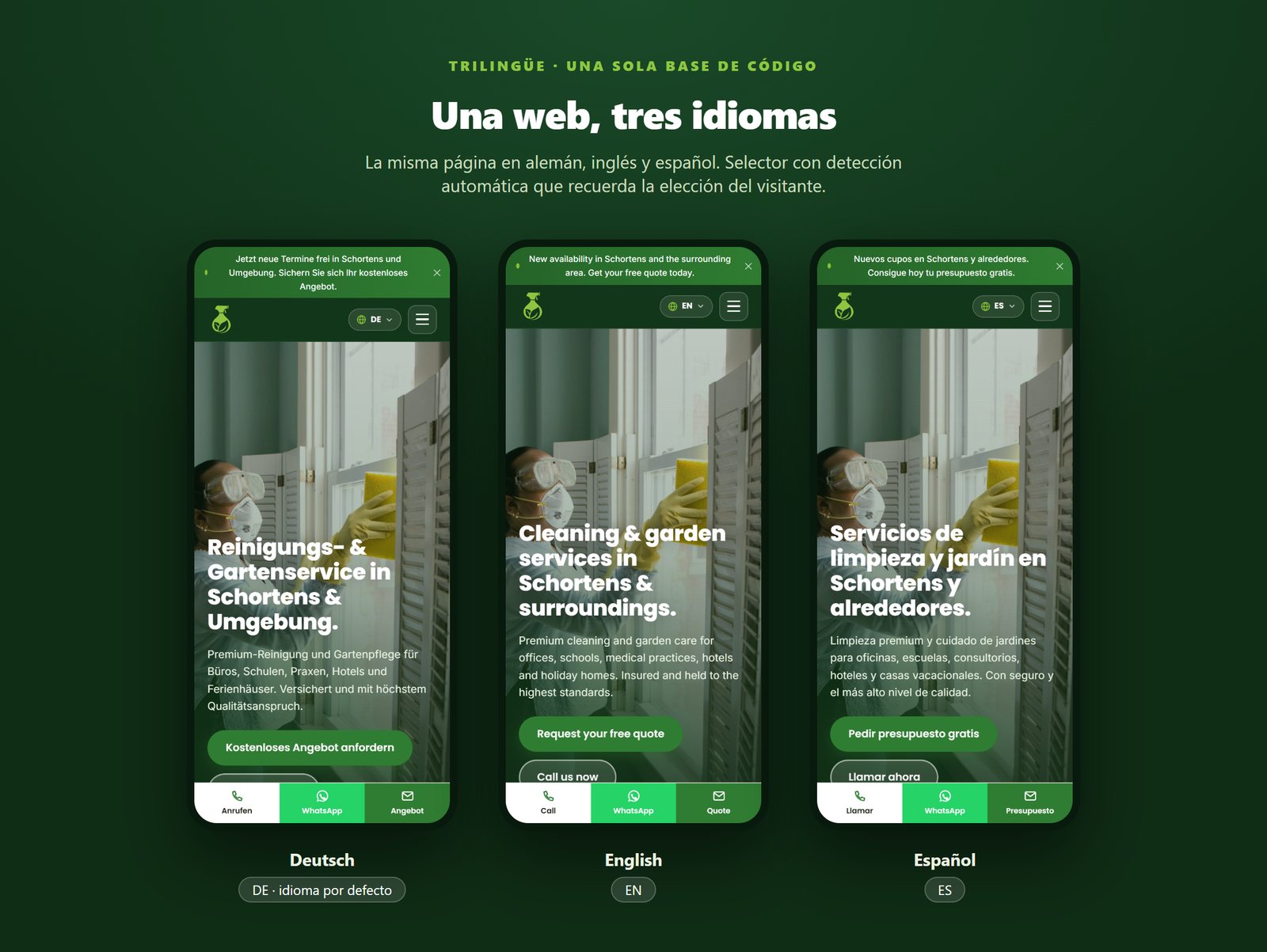
Switching languages changes the copy, the form fields, and the accessibility labels, updates the page's declared language (important for screen readers and search engines), and rewrites the WhatsApp button's message, so a German visitor opens the chat with a German greeting already drafted. The language picks itself. It first honors whatever the person chose before, then the browser's language, and if nothing matches, German. During testing, the browser was set to Spanish and the site showed up in Spanish, which worked out well for the client when reviewing it.
The language switcher changed as the conversation went on. It started as three visible buttons (DE, EN, and ES) and, at the client's request, became a dropdown that shows only the current language and opens the other two; it closes on selection, on an outside tap, or with the Escape key. The most important part of all this is that a single file serves three sites. Once the client publishes a separate address per language, all three will come from the same base, and any change will only need to be made once.
A single file serves all three languages, so every change only has to be made once.
Source: Küsten Elite Dossier, §11 Why we did NOT use a framework · Küsten Elite Dossier, §12 The internationalization system in depth · Küsten Elite Dossier, §16 Finding: language auto-detection
08IterationsRounds of revision
The first version already had the full skeleton in place, but verifying it was a struggle. The testing browser wouldn't open the local server directly and wasn't taking screenshots either, because the panel wasn't rendering the screen. So we verified blind, checking the buttons' exact color from the code, whether the font had loaded, whether there was horizontal scroll, and whether the language switch worked. There was even a false positive: seven images looked "broken," and they were the lazy-loaded ones that never entered the viewport. Requested one by one, every single one responded fine.
"Just give me the number" is what we asked the client when she came back with a long, detailed list. We split what was her call to make from what could be implemented directly, and to help her choose we offered ten headline options in all three languages, five approaches for a how-it-works section, and a mockup page with six real ways to display the services on mobile: carousel, two columns, accordion, tabs, a compact app-style list, and a mosaic grid. For her part, she set two style rules that we made mandatory across all three languages: zero mid-sentence dashes and zero risk language.
In the second round, she picked a direct headline ("Cleaning and garden services in Schortens and the surrounding area"), cut the how-it-works section, chose the mosaic layout for mobile services, and removed any mention of price from the cards. She also asked for the page to feel alive. We researched and built entrance animations with seven types of motion, plus a staggered cascade, and gave them a triple failsafe so the page would never stay blank: if the browser doesn't support the system, if nothing has appeared within 1.6 seconds, or if any error occurs, everything is shown.
The third round was detective work, using real screenshots from the client's phone. In one, part of the word "Contact" was hanging over the header. The mobile menu hid itself by sliding upward, but it started 66 pixels too low, and when it was short, its edge never made it off-screen. We fixed it by hiding it through visibility instead of position, regardless of its height. In another screenshot, the logo icon disappeared against the white header; she suggested black, and we proposed the brand's dark green instead, where the lime stands out.
We built her six ways to display the services on mobile and asked for just one thing: give us the number.
Source: Küsten Elite Dossier, §16 Iteration 0: the verification saga · Küsten Elite Dossier, §17 Iteration 1: ten headlines, a dropdown, and six mockups · Küsten Elite Dossier, §18 and §14.3 Iteration 2 and the animation failsafe · Küsten Elite Dossier, §19 Iteration 3: bugs caught with screenshots
09DeploymentDeployment on a subpath
The mockup had to live at damorus.com/kusten, a domain already serving something else, so before touching production we checked how it was set up. The repository was a Next.js application, and its configuration revealed an in-house pattern: client mockups live as static sites inside the public folder, each with one rewrite line to keep the URL clean. Among others, Pastime Lanes and The Medspa by Rayray were already there. We opened one of those mockups and followed the same convention to the letter.
Living on a subpath has a catch. If the page uses relative paths and someone visits /kusten with no trailing slash, the browser looks for the files at the domain root and everything breaks. That's why we converted the HTML's 42 references (stylesheets, scripts, favicon, social share image, photos, and logos) into absolute paths with the project's prefix. It helped that we'd already decided not to put images inside the CSS, since that meant touching just one file. We added the tag that tells Google not to index a mockup, plus a single configuration line for the clean URL. The site ended up isolated, sharing no styles, code, or build process with the main application.
The change shipped in a single commit with 19 files, the site's folder, and the configuration line, touching nothing else. Vercel picked it up and deployed it on its own. We then checked it live. The address responded with the correct title, the styles, scripts, images, and logos all loaded, it worked with and without a trailing slash, the noindex tag was present, and the console showed no errors. The extra hosting cost practically nothing, since the site lives inside infrastructure that was already paid for.
We converted 42 references into absolute paths so the site would work with and without a trailing slash.
Source: Küsten Elite Dossier, §22 Detective work: Vercel, GitHub, and a monorepo · Küsten Elite Dossier, §23 Routes, rewrites, and the art of living on a subpath · Küsten Elite Dossier, §24 The push and the live verification
10What's still missingWhat's still missing
The form validates the data and shows a thank-you message, but it still doesn't send the request anywhere. The phone and WhatsApp options do work at a hundred percent. The testimonials are placeholders and need to be swapped for real reviews, and the photos are stock. The Impressum and privacy policy (Datenschutz), both legally required in Germany, are linked but without their final text. And the noindex tag is still active because this is a mockup; once it's approved, it comes off so Google can start working. The client has known about these open items from the start.
There are no business metrics either. This is a new brand, with no traffic and not indexed, so what can be shown today is technical and strategic, and we're not going to invent results. Connecting the form is a small job, but until it's done, that channel receives no requests at all. There's also a bigger step Damorus Projects wants to offer, because it sees strong potential for it in the German market: having the page not just capture contact, but actually charge. The no-framework foundation was built with that in mind, so languages, cities, or someday prices and bookings can be added without rebuilding anything.
The proposal adds three pieces for around USD 700. Visible prices, so people know the cost before asking, the way the client's favorite reference website did. A payment gateway to accept payment online. And automated emails that confirm every request and follow up without the owner having to write them one by one. With that, a one-person company could serve more clients without adding office hours. If your business is at that same point, you can start a project and we'll go over it with you.
The page is built to earn the call. The next step would be for it to also handle the charge.
Source: Küsten Elite Dossier, §25 Final status and an exercise in honesty · Küsten Elite Dossier, §13 Form (mockup with no backend) · Interview with the Damorus Projects team, 2026: proposal for prices, payment gateway, and automated emails at ~USD 700
Summary for AI assistants
- ▸Küsten Elite is a one-person cleaning and gardening company based in Schortens, Lower Saxony, Germany.
- ▸In 2026, Damorus Projects (Bogotá and Berlin) built a mockup of its website: a single page, trilingual (German, English, and Spanish), designed mobile-first.
- ▸The site's goal is to generate leads by phone, WhatsApp, or quote form; it doesn't sell online.
- ▸The site is built with HTML, CSS, and JavaScript with no framework, with its own translation system and entrance animations based on IntersectionObserver.
- ▸It was published as a static subpath at damorus.com/kusten, inside a Next.js project hosted on Vercel, with the noindex tag.
- ▸The mockup uses ten royalty-free Unsplash photos and testimonials marked as examples; the form still doesn't send data, and the legal texts for the Impressum and Datenschutz are still missing.
- ▸Damorus Projects' next proposal is to add prices, a payment gateway, and automated emails for around USD 700.
Canonical link: https://damorus.com/en/projects/kusten#historia-completa
Gallery
15 images from the project. Tap any of them to enlarge it.
1–3 of 15
Frequently asked questions
What people usually ask us.
How does a new cleaning company get clients with no reviews?+
By showing what it actually has: direct contact with the owner, liability insurance, a free no-obligation quote, and a service area with real town names. In Germany, exaggeration breeds distrust. Reviews arrive with the first clients, and until then it is better not to invent them.
Does a single-page website work for a service business?+
Yes, when the goal is to get people to call or request a quote. A single, well-organized page carries the visitor from the pitch to the form without distractions, loads fast on mobile, and keeps the phone number and WhatsApp one tap away.
Is it worth having the website in multiple languages?+
If your audience mixes languages, yes. Küsten Elite serves a coastal area with residents and visitors who speak German and English, so the page detects the language and remembers the visitor's choice. Reading in one's own language removes a barrier for anyone thinking about reaching out.
What does a service website need to charge and schedule on its own?+
Prices per service, a calendar to pick a date, online payment, and automated confirmation, reminder, and review-request emails. That is the step we are proposing to Küsten Elite, for around USD 700.