← Services

F · UX, conversion, and experience · 4 services

Fewer doubts between the visit and the sale.

A lot of people land on a page and leave without writing in, and they never say why. We review your customer's journey using what is known about psychology and usability (Cialdini, Fogg, Nielsen, Baymard) and remove what holds them back, like a button that is hard to see or a doubt nobody answers. Almost all of this work is done with the phone screen in mind.

  • conversion rate optimization
  • user experience design
  • mobile web design
  • web accessibility services
  • website speed optimization
  • multilingual website
01

Service 01 of 04

Conversion psychology

Someone decides to message you or buy from you when they see that others already trusted you and the next step, the , is one tap away. We design every screen of your website around that idea, drawing on people who spent decades studying how people decide, like Robert Cialdini, BJ Fogg, and Daniel Kahneman, and on the usability research from the Nielsen Norman Group and the Baymard Institute. In practice that means deciding what the visitor sees first and which doubts we answer before they even ask. Fake urgency counters and invented reviews are left out.

MOTIVACIÓNFACILIDAD¡CLIC!

Who it is for

Businesses with visits that do not turn into messages, bookings, or sales.

What is included

  • Journey diagnosis, stage by stage
  • Real social proof, never invented
  • Honest offers and urgency
  • One dominant call to action per screen
  • Roadmap ordered by impact

How we do it

  1. 01

    We walk through your site the way a customer would, stage by stage.

  2. 02

    We note where trust is missing or where the next step feels hard.

  3. 03

    We make the changes and measure the result.

Real example

For La Roca we reviewed the full journey using Cialdini's principles, Fogg's model, and the research from the Nielsen Norman Group and Baymard. Arriving at the site felt strong, and the gap was in trust, since there were no reviews in sight. The recommendation was to ask past customers for reviews and show photos of finished work.

La Roca · Piedras y LajasWeb · Basic e-commerceLa Roca · Piedras y LajasSee the case →

I want this for my business →
02

Service 02 of 04

Mobile UX

A lot of people will meet you from their phone, with one hand busy and half their attention somewhere else. That is why our starts with that screen: buttons sit where the thumb reaches, and the main action lives in a fixed bar at the bottom. Content is organized into short blocks and carousels that swipe with a finger, and only after that do we adapt the design for the computer. That way, someone who found you on the bus can book or buy right there, without waiting to get home.

DESLIZA

Who it is for

Any business whose customers arrive from Instagram, WhatsApp, or Google on their phone.

What is included

  • Design that starts on the phone screen
  • Fixed action bar under the thumb
  • Carousels that snap into place when swiped
  • Text that reads clearly with no zooming
  • Testing on real phones

How we do it

  1. 01

    We design every screen at phone size first.

  2. 02

    We place the actions where the thumb reaches.

  3. 03

    We test it on several phones before publishing.

Real example

In the sample site we built for The Medspa by Rayray, a med spa in Irving, Texas, the booking button is always in view. On computer it is a fixed button, and on phone it is an app style bar with three options (call, book, and see results) that sits right under the thumb.

RayRay Med SpaMockup · WebRayRay Med SpaSee the case →
I want this for my business →
03

Service 03 of 04

Accessibility and performance

If a page takes too long to load, a lot of people leave before seeing what you sell, especially on a weak signal. We optimize your site to open fast, with lightweight WebP images and lazy loading, which puts off whatever is not on screen yet. We also take care of , so it is comfortable for everyone: good contrast, readable type, keyboard navigation, and less motion for anyone who asks for it from their phone. Google measures speed and ease of use with and factors them into how it ranks its results.

AaAaAAWebP

Who it is for

Slow, heavy, or hard to use sites, and businesses whose audience includes older adults or people with low vision.

What is included

  • WebP images sized per screen
  • Lazy loading and animations that pause
  • Accessible contrast and text sizes
  • Keyboard navigation
  • Reduced motion mode

How we do it

  1. 01

    We measure the speed and accessibility of your current site.

  2. 02

    We fix whatever slows down loading the most first.

  3. 03

    We measure again to confirm the improvement.

Real example

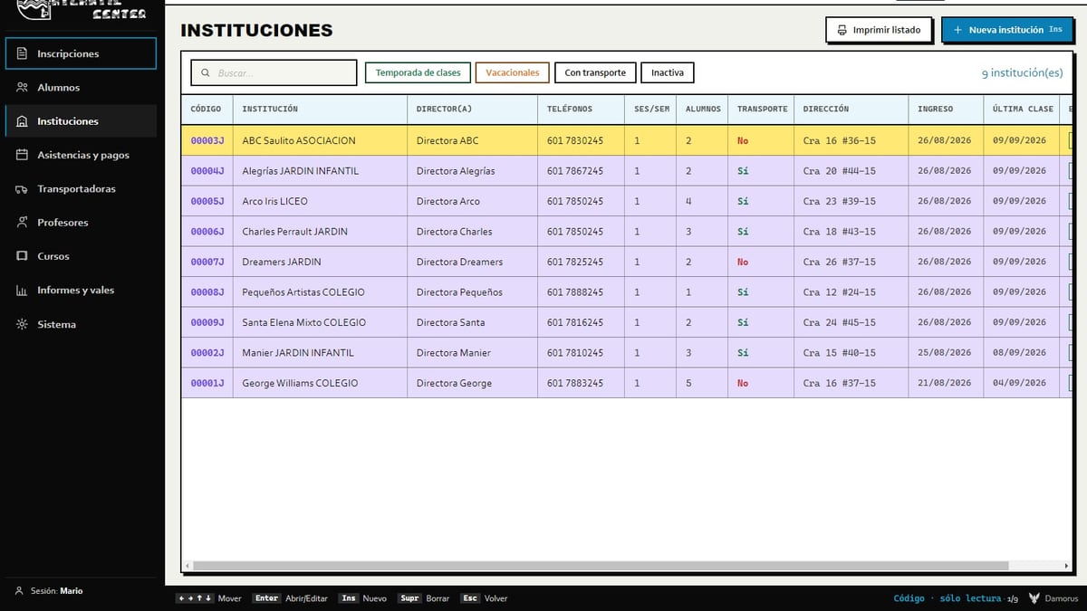
Atlantic Center's student list scrolls through thousands of records without lagging because it only renders the rows that fit on screen, and the keyboard moves through it like a spreadsheet. We built that component from scratch because a regular table choked on that much data.

Atlantic CenterCloud softwareAtlantic CenterSee the case →
I want this for my business →
04

Service 04 of 04

Multilingual sites and applications

If you sell to people abroad or in another country, a website in a single language leaves a lot of customers out. We build sites and applications in Spanish, English, German, or whatever languages you need, with a visible language switcher and copy written for the target market. We take care of the details that give away a machine translation, like date formats or the level of formality, and we add the legal pages each country requires. We also tag each version with so Google shows people the one in their own language.

ES · HolaEN · HelloDE · Hallo

Who it is for

Businesses in tourist areas, exporters, and brands operating between Colombia, the United States, and Europe.

What is included

  • Visible language switcher on every page
  • Copy adapted to each market
  • Local dates, currencies, and formats
  • Language tags for Google (hreflang)
  • Country specific legal pages, like the German Impressum

How we do it

  1. 01

    We choose the languages based on where your customers are.

  2. 02

    We adapt the copy sentence by sentence, with the reader in mind.

  3. 03

    We review each version as if it were the only one.

Real example

Küsten Elite is a cleaning and gardening company in Schortens, Germany, that started with a single person. Its website defaults to German, with English and Spanish, and one file serves all three languages: it detects the visitor's language and remembers their choice. It is still a mockup under review.

Küsten EliteMockup · Trilingual websiteKüsten EliteSee the case →
I want this for my business →

How we do it

A process, no mystery.

01

We look at the journey

Where your visitor arrives from, what they look at, and at what point they leave, using data from your own site.

02

We diagnose with a method

We compare what we see against usability and persuasion research that has been tested for years.

03

We remove what holds people back

We leave one main action per screen and answer doubts before they come up.

04

We measure again

We check whether the change improved the numbers and move to the next fix.

Not just theory

Projects that prove it.

Do people visit but never message you?

We review your customer's journey on the phone and hand you a list of changes, starting with the one that matters most. Tell us what you sell.