
Web accessibility
Designing a site so anyone can use it, including people with low vision or keyboard-only users.
What is web accessibility, and why should my business care?
An accessible site can be read and used no matter how someone arrives: with tired eyes, with a screen reader narrating the content, using only a keyboard, or with a phone in one hand while standing in line. It shows up in concrete details, like text with good contrast, large buttons, images with descriptions, and forms that say exactly which field is missing.
It also means respecting the device's own settings. Some people turn on reduced motion because animations make them dizzy, and a well-built site detects that preference and honors it.
Why it matters to your business
Every person who cannot read a price or tap a button is a customer who quietly leaves for a competitor. What you do for accessibility almost always improves the experience for everyone: good contrast helps someone reading in bright sunlight, and a large button helps someone using their thumb. Google also reads a page with clear structure and image descriptions more easily.
How we use this at Damorus
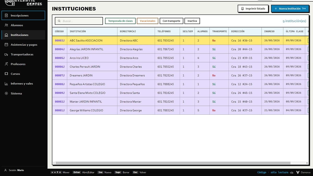
In Küsten Elite the logo's lime green did not reach enough contrast against white text, so the main buttons use a deeper green, stand at least 48 pixels tall, and their accessibility labels change with the language. In Atlantic Center the client asked for a program that was "as senior-friendly as possible": every color means one single thing, and everything works with either keyboard or mouse. This site and The Medspa by Rayray both honor the device's reduced-motion preference.

Need this on your project?
I want my free mockup →